Introduction: Golden ratio in design
When a business owner creates a logo, they’re doing more than just choosing an image or typography. They’re telling the world what their business is about and what it represents. It’s a visual representation of their values and their personality. So, it’s essential to get it right. One concept that can make a logo truly exceptional is the Golden Ratio. The Golden Ratio is a mathematical principle found in nature that can help create a harmonious and pleasing logo design. In this blog post, we’ll explore the Golden Ratio and how it’s used in logo creation.
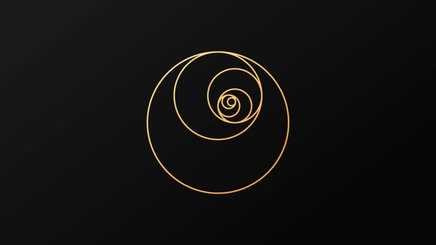
What is the Golden Ratio layout?
The Golden Ratio is a mathematical principle rooted in geometry that describes a ratio equal 1.618 . The ratio shows up repeatedly in nature, from the spiral of a shell to the spiral arms of galaxies. It represents perfect harmony and balance. This ratio becomes beautiful to us, and we instinctively react positively to it.
How Does the Golden Ratio Apply to Logo Design?
Designing a logo can be a complex task, but the Golden Ratio offers a reliable framework to use for creating a balanced and harmonious visual message. The ratio can help you find the perfect balance between form and function, aesthetic appeal and legibility, and visual appeal and symbolic meaning. Many of the best and most recognizable logos we know use the Golden Ratio to create harmony.
Examples of Golden Ratio in Use:
One famous example of the Golden Ratio implemented in a logo is the Apple logo. The logo’s shape is a perfect rectangle using the Golden Rectangle approach, and the iconic bite mark is placed against the vertical division line. Another example of the Golden Ratio at play is the Twitter logo. The iconic bird is leaning at an angle of approximately 40 degrees. Again, this logo correctly used the Golden Ratio’s harmonious principles to create a memorable visual identity.
composition behind the golden ratio
The golden ratio is a mathematical ratio is design principle that has been used throughout history to create harmony and balance in visual art. Interestingly enough, this principle has also made its way into the world of logo design. Just take a look at some of the most recognizable brands out there, such as Pepsi and Apple. Believe it or not, their logos were designed with the Golden Ratio in mind! And it doesn’t just stop there. When it comes to the Real Estate Brochure, incorporating this design principle into a logo can not only create a visually appealing brand but also helps to establish a sense of trust and professionalism among potential clients. So the next time you’re designing a logo, consider adding a little Golden Ratio magic to take it to the next level.
Advantages of Using the Golden Ratio:
Using the Golden Ratio in logo design has its advantages. One, it creates a sense of balance and harmony that provides natural appeal to the human eye. Two, it creates a unique and memorable design that stands out, even in a sea of other logos vying for attention. Three, it gives designers a system to follow, making the design process more efficient and predictable.
Best Graphic Design company, working on golden ration design in logo
Have you ever heard of Rjm Inc? Well, let me tell you – they are one of the best graphic design companies out there! What sets them apart is our unique approach to logo design through the use of the golden ratio. Not only does this technique create visually appealing logos, but it also adds a sense of balance and harmony to the design. Rjm.Inc. takes the time to understand our clients’ businesses and values, ensuring that our logos accurately represent the company’s brand. If you’re looking for a logo that truly stands out and captures the essence of your business, Rjm.Inc. is the company for you.
Conclusion:
The Golden Ratio is not a magic formula. Still, it can provide a valuable tool for business owners looking to create a harmonious, aesthetic, and memorable logo for their business. Keep in mind that it won’t work in every situation, but it’s an essential concept that designers can use to create a better logo. At the end of the day, the most crucial factor in logo design isn’t the math behind it, but the brand message that the logo conveys. The Golden Ratio is just one piece of the puzzle. The balance of aesthetics, appeal, and symbolism for your brand is key.
Add a Comment